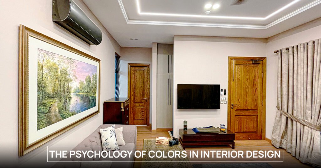
Let’s be honest—most of us choose paint colors based on what “looks nice.” We flip through swatches, scroll through Pinterest, and maybe even match it to a favorite rug. But here’s the thing: color isn’t just decoration. It has weight. It changes how we feel in a space, best architects in Lahore move through it, and how we live in it. We’ve seen it firsthand at Archi Cubes—how a wrong color choice can make a beautiful space feel off, and how the right tone can quietly pull everything together. Color has interior design psychology. It’s emotional, cultural, and completely personal. This blog isn’t about rules—it’s about understanding what color actually does, so your space supports your life—not just your Instagram feed.
Warm Colors: Where Energy Lives and Conversations Start
Warm colors pull you in. They’re cozy, confident, and hard to ignore. A deep orange in a dining room can feel inviting. A soft red in a living space might encourage conversation. But go too bold, and it can feel suffocating. We’ve had clients who loved fiery tones—until they lived with them for a week. The trick? Balance. We often tone things down with earthy shades—terracotta, rust, burnt sienna—things that still give warmth without overwhelming the room. Warm tones are great for social spaces, but they need breathing room. Think accent walls, textured fabrics, or lighting that softens their glow.
Cool Tones: Calm the Room, Clear the Mind
There’s a reason so many bedrooms and lounges are painted blue or green. Cool tones have a calming effect. They’re less “look at me” and more “you can exhale now.” These colors work really well in bedrooms, studies, or any space where you want to wind down. At Archi Cubes, we’ve used sage green in kitchens, misty blue in bathrooms, and even seafoam in open lounges. They’re subtle, but they do something real. They slow you down. Help your eyes rest. In a city like Lahore, where life can get noisy and chaotic, these colors give your home a bit of peace.
Neutrals That Actually Do Something
People think neutrals are the “lazy choice.” They’re not. Getting the right neutral is one of the hardest parts of interior design psychology. There’s warm greys, cool whites, creamy taupes, and dozens of shades in between. The magic of neutrals is that they let everything else in the room breathe. Your textures, your light, your layout—neutrals let them shine. They’re also incredibly versatile. Want to go bold later? Throw in a mustard sofa or deep green curtains and you’ve got contrast without chaos. If you’re the kind of person who gets tired of color fast, neutrals give you room to change your mind—without repainting the whole house.
Darker Shades, Deeper Vibes
A charcoal bedroom. A navy wall in the dining room. A black kitchen cabinet. Sounds risky? It can be—but when done right, dark colors are stunning. They make spaces feel grounded, intimate, and unexpectedly cozy. The key is lighting and contrast. In smaller rooms, we often pair dark walls with light flooring or reflective surfaces. In larger spaces, dark tones can pull the room together and give it weight. Clients are usually scared of going too dark—until they see it finished. Then they say things like, “This room feels expensive.” Dark doesn’t mean gloomy. It means mature, considered, and confident.
Accent Colors That Speak Louder Than Words
Sometimes you don’t need to go all in. A mustard armchair. A teal tile backsplash. A dusty pink artwork in a neutral space. These little moments of color—when used intentionally—bring personality without overwhelming the room. We’ve had clients say, “I love color, but I don’t want to live inside a crayon box.” Fair enough. This is where accents come in. Let your furniture, cushions, art, or even light fixtures carry the color. That way, if your taste changes (and it will), you can switch things up without repainting every surface. It’s a low-risk, high-impact way to express yourself.
Color Comes with Meaning
We don’t just pick colors because they look nice. Color has layers—it’s tied to memory, mood, and meaning. Some people are drawn to yellows because it reminds them of home. Others avoid green because of personal associations. Pakistani architects always ask: What colors do you already live with? What do you want your home to feel like? Because design isn’t about imposing a palette—it’s about listening and responding. Whether we’re working with earthy naturals or bold jewel tones, the process is always personal. Cultural context matters. So does your lived experience. And when we land on a color that just feels right, you’ll know.
Pick the Colors That Feel Like You
If you take anything away from this post, let it be this: your space should feel like you. Not like a showroom. Not like a Pinterest trend. You don’t need to justify liking lavender or hating beige. What matters is how you feel when you walk into your room after a long day. At Archi Cubes, we’ve learned that color is never just about the walls. It’s about memory, identity, emotion—and creating a space that holds all of that. If you’re unsure where to start, start with how you want to feel. Color will follow. And if you need help translating that into interior design psychology—well, that’s what we’re here for.


